Silvae
Eau de parfum
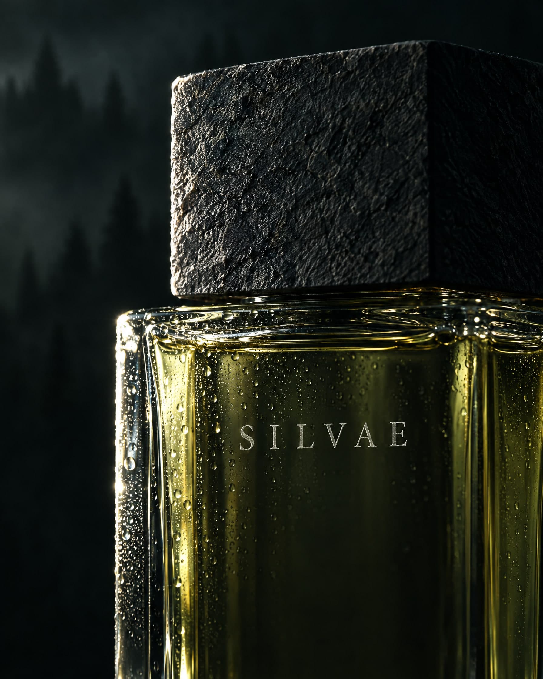
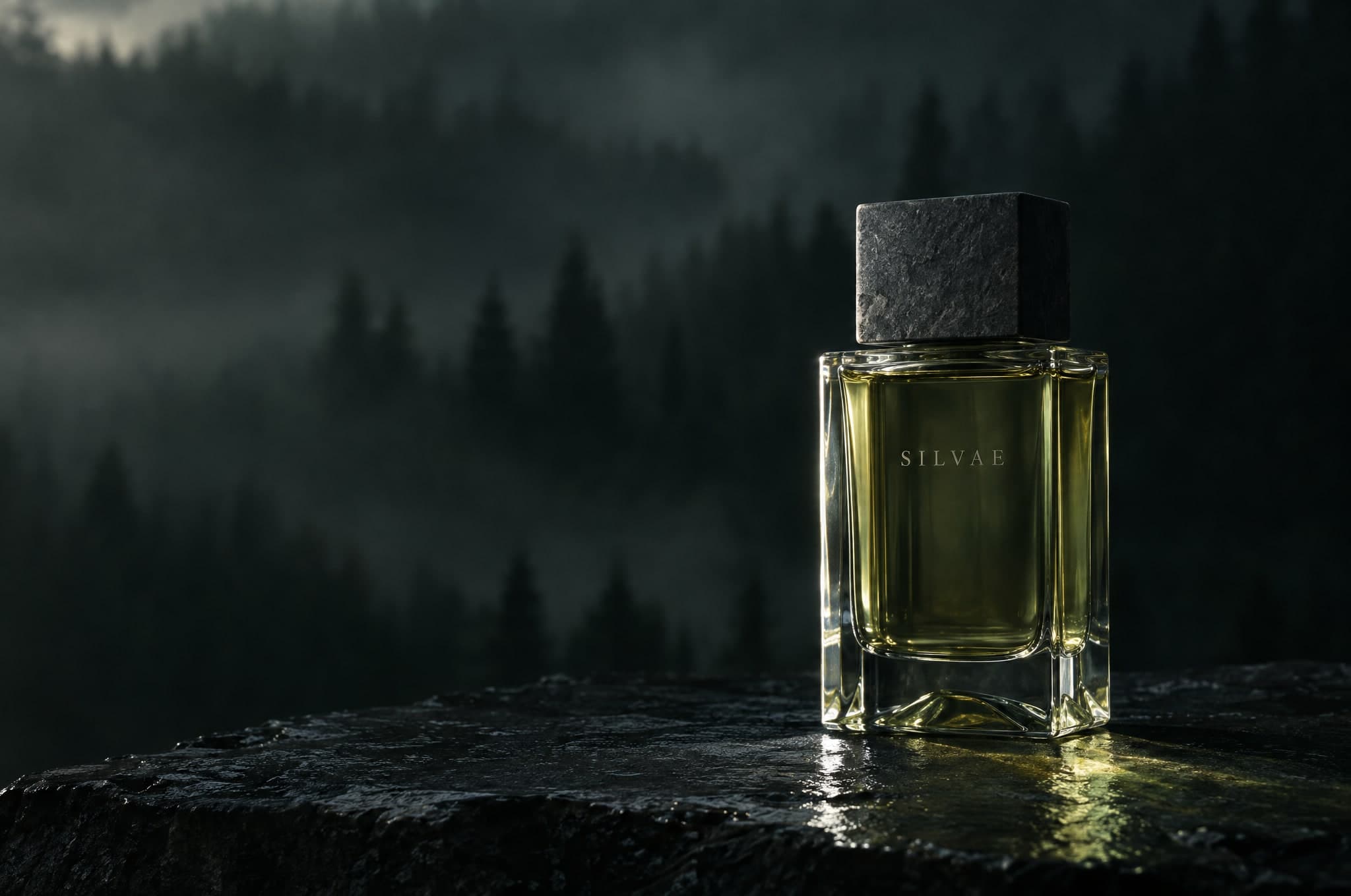
One forest at dusk, after rain. Bergamot and black pepper at the edge of the trees, cedar and fir balsam under the canopy, then vetiver, oakmoss and a trace of smoke on the skin.
Quiet, cinematic and tactile. The site moves like a walk into a forest at dusk.
Silvae is a fragrance house we invented for this concept. It makes one scent, built around one forest, and sells it in a heavy glass bottle with a cap cut from stone.
The brief we set ourselves: launch that single scent online in a way that feels as considered as the bottle. With only one product, every page has to earn its place.
The real problem is that a website cannot carry a smell. Image, pace and words have to do that work, so the site is slow where it should linger and plain wherever someone is ready to buy.
Your bag
Your bag is empty.
The house
Concept preview: the story of the house would open here. Silvae is fictional, so there is no page behind this link.
Your bag
Your bag is empty.
The house
Concept preview: the story of the house would open here. Silvae is fictional, so there is no page behind this link.
Top notes, the first minutes
The edge of the forest. Cold air, bright and a little sharp, like the first breath after rain.
Heart notes, the first hours
Under the canopy. Resin and damp bark, the green of the needles, and the quiet.
Base notes, into the evening
Dusk. Wet stone, roots and moss, and a fire somewhere far off. This is what stays on the skin.
Eau de parfum
One forest at dusk, after rain. Bergamot and black pepper at the edge of the trees, cedar and fir balsam under the canopy, then vetiver, oakmoss and a trace of smoke on the skin.
Your bag
Your bag is empty.
The house
Concept preview: the story of the house would open here. Silvae is fictional, so there is no page behind this link.
Eau de parfum
One forest at dusk, after rain. Bergamot and black pepper at the edge of the trees, cedar and fir balsam under the canopy, then vetiver, oakmoss and a trace of smoke on the skin.
Your bag
Your bag is empty.
The house
Concept preview: the story of the house would open here. Silvae is fictional, so there is no page behind this link.
On a phone the navigation moves to the bottom of the screen, so the scent and the bag are always one thumb away.
The bottle comes before any words. On a small screen the photograph has to do the persuading, so it comes first and takes most of the view.
Reading text stays at 16 px or larger. The light serif is kept for headlines, where its fine strokes hold up; everything small is set in a plain sans.
Cormorant Garamond at display sizes, in its light weight, so headlines feel engraved rather than printed. The wordmark is set in spaced capitals because that is how it is etched on the glass. Small interface text uses a plain sans, so it stays readable at any size.
Cedar, after rain.
Silvae
Taken from the photographs: the green-black of the forest at dusk, a cool bone for text and lichen as the one accent, kept for focus, hover and the note you are reading. Every pairing used for text passes WCAG AA.
Slow and tied to scroll. Notes arrive as you reach them, the image moves a little closer as the scent settles, and the one film on the page has a pause control. Nothing bounces, and with reduced motion turned on everything is simply there.
Next concept
ConceptRestaurant & hospitality